
The web moves fast, very fast. Websites that were fresh a few years ago now look like they are from the ’90s. (in case you were not sure, in web years that is around the time the pyramids where built) I have a theory that a website lasts about as long as an iPhone. Sure you can make that old iPhone 3GS keep running, but it has started to feel pretty old hasn’t it? What? Your iPhone does not handle LTE? Time for an upgrade! I admit there is a delicate balance between a complete overhaul and a redesign. Google cannot completely redesign their search page every year or two or they will lose the consistency they need to maintain their customer base. But for schools things are different. I think a “new look” every 5 years or so (okay so that is a little longer than the lifespan of an iPhone) is a necessity and here at AES our website is overdue for an upgrade.
The Plan
Even though my first instinct is to start working on the look of the website, I know we need to first tackle its purpose. It seems like the current website was “designed by committee”. Sure there are lots of advantages to that. The workload is shared. People all feel heard and get their needs met. But in the end sometimes the “designed by committee” concept fails to pack the punch that a simpler, targeted website can provide. Our new website will not meet the same set of needs in the same ways. The current website was designed to be an all-in-one portal but our new goal is to simplify things. The first step for us was to identify the audience. We have decided at this point that this is primarily prospective families and faculty. This will be somewhat of a shift for us since the old/current website seeks to be everything for everyone. The new site will be simple in design and in it’s purpose. Yes, we will have to deal with a lot of that old content in some way and that will be a part of this overhaul.
Simple design is King
I truly want the new website to make everyone sees it say, “Wow”! Part of this, for me is to make the website simple with good hierarchy in mind. I am fascinated by the research out there on eye tracking and design. Specifically I am interested to see that people’s eyes are drawn not only to images, which is what I would have assumed, but also to text. Even the subtle differences in text styles, spacing etc. make a difference. I have to say, honestly I am struggling with the work of designing of our new website. In particular I am deciding whether to hire an outside designer or “go it alone” and handle the design internally. Many of the professional designs I see are not that appealing. They look like the same old designs just recycled, recolored, and reordered. I don’t mind using my previous school as an example. The new design is fantastic, but the basics are the same. New photos, a little shifting of links, etc. but the design is not radically different. I want radical and I am not sure the average professional web designer will be willing to take the risk to design what I want.
My plan is to fill the home screen with a nice bold image, with some “thrilling” elements as well. Some of my favorite inspiration comes from Apple’s “30 years” site and a BRCK. I love the simple design, with nearly zero clicking required for the primary content. You just scroll and things are revealed. You’ve heard that all the content on a website should be no more than two clicks away. My goal is zero clicks, just a scroll or hover for the primary content.
An evolution of the AES website
To get an idea of where you are headed, it’s always nice to take a look at where you have come from. I thought it might be nice to see what the AES website has looked like over the years. Below you’ll see snapshots of four different AES websites since 2000. I’ve have to say the design has been changed for the better over the years. Personally I cannot wait to see where we end up in this evolution!

http://www.aes.ac.in circa 2000
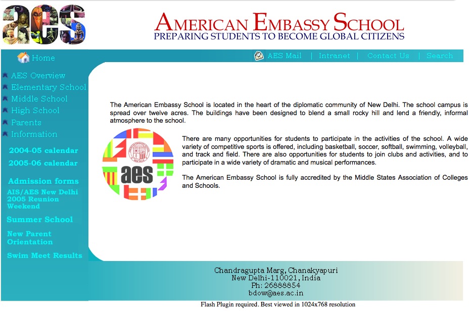
http://www.aes.ac.in circa 2004

http://www.aes.ac.in circa 2006

http://www.aes.ac.in circa 2012
So the process has just begun, but I think things will move along nicely once we get the basic purpose and design agreed upon. Our current timeline has the content and design issues solved before the end of May, then gives us a semester (until Dec. 2014) to get the actual site designed and built. Keep your eyes out for www.aes.ac.in in Jan 2015. Let’s hope you take a look and say, “Wow”!

David, this comprehensive post about the evolution of the AES was such a great read! Its so funny to look back at websites (from not too long ago) and realize how dated the design looks to us now. I’m sure there is a lot to mull over in considering the new layout and design, and I’ll check back in in January. Lets give a shout-out to your wife for lugging the drop-down menu around for shots around campus!
Thanks for the shout out Drew! I got a kick out of those old websites too. I especially love the wordart/3D “AES” in 2006!
Hey Dave, I’m not sure how quickly the redesign of our web site needs to take place, but what about getting some of the our keen computer students involved, maybe run it as a class for a semester, or if needed, two. You shouldn’t have to “Go it alone”, use our resources. I’m sure that there are many advanced students who would want to be working on a real live project like this. It would be a great thing for those students to be able to put on their college applications. This is an important task, it is a reflection on who we as a school are and who we want to be. A slick web site says a lot. Good luck on this, we’re all counting on you!
Hi David,
I wrote a post about your impromptu presentation in our Course 3 class and its influence on my website redesign (http://www.coetail.com/stanleyaes/2014/04/15/the-delayed-redesign/). I think your examples, especially the Apple’s Thirty Years of Mac, really helped me decide what I wanted to do (and what I valued) to redesign my website. After listening to your presentation, I knew I wanted to design a website that was simple (one or two clicks to get to anything), functional, and aesthetic. While not Apple’s masterpiece, I believe I got a lot closer to those three components than I did with my “old” design.
I really like your post. Thanks for showing us the evolution of our school’s website. I agree that the window of time for designing a website and making it meet the needs of all its users is closing quickly. It may be five years now, but down the road, we may need to redesign it every two or three years.
What did you use to capture the previous year’s web designs? Did you have them in an archive or did you use “The Way Back Machine”? Also, when you redesign the website, how will our values and belief statements impact the design, if at all?
Thanks for a great post!
Stanley
Hey Stan! Glad you liked the blast from the past on the AES website. Yes I did use the “Way Back Machine” aka archive.org. It took some hunting as the “machine” caches lots of copies of websites but it gets a little confused when website bounce around to different hosts like ours used to.
Yes I really want the redesign to reflect AES values. I think it is great that we are revisiting our mission through a facilitated process this fall. Our new website should scream “AES!”. I think the key there will be in the images. I know that the design itself, using simple elements, etc. will help but nothing says AES like an image of a kid on the ES rocks or an HS student in Reach Out etc. The problem is that we need the images. I think it is time to send out another call for images so that we can get the website populated with some amazing ones over the next 6 months, before the resigned is unveiled.
Glad you like the post and thanks for the comment Stan!